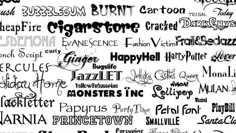
Perfect Fonts for Your Choices

Faced with the magnitude of the work involved in writing a novel, the choice of the typeface may seem like a detail. But come to think of it, it’s not at all, because a bad font can affect the quality of your text and put off your readers.
Keep in mind that your readers will be reading your book, so making it as enjoyable as possible needs to be read.
So how do you choose the right font? You can visit with https://ingramer.com/tools/fonts-generator/ now.
What is a font?
In typography, called writing font or characters, a set of visual representations of characters of the same family with the same style.
Times New Roman, Arial, or Verdana are the most popular fonts because they are legible and easy to read, but there are a number of others with all their pros and cons.
Some are more suitable for writing on paper, others will look better on the screen. An ideal font on paper is not necessarily the best on screen, and vice versa. Still others are to be favored for the cover and the title of the book, for example.
On what criteria should you base your choice?
The paper book
Studies have shown that serif (or serif) fonts are more readable, more pleasant, and faster to read on paper than sans serif fonts.
Among the serif fonts you will find: Garamond, Times New Roman, Century, Georgia, and Book Antiqua
But their presence in this list doesn’t necessarily make them good to use. (Ouch, it’s getting complicated)
Indeed, the Times New Roman font is clearly discouraged. Why?
Specifically designed in 1931 for a column publication, this font quickly established itself in the London Times newspaper and then in other dailies. Dense and not cumbersome, it offered a strong contrast on a lower quality of paper.
Microsoft then made it world famous by making it the default font for its Word editing software. However, since version 2007, it has been superseded by Calibri.
- Used and reused excessively, Times New Roman ended up boring readers and deserting all paper media.
- Other fonts with serif are therefore preferred. Garamond, Georgia or Book antiqueis all very elegant.
- Garamond was specifically designed for literary printing. It is now the most common in paper books.
- Georgia meets with great success. This font is used more and more.
- Personally, I have a soft spot for Book Antiqua which I use for all “my” biographies.
- Regarding screen reading, the choice is wider.
- Some fonts have even been specifically designed for screen reading.
There are some with serif or without serif:
Fonts with serif:
- Lucida, Verdana, Tahoma, or Georgia considered the best font to use for screen display.
Sans serif fonts:
- Arial, Calibri, Verdana, Franklin and even Tahoma.
Note: Like Times New Roman, avoid Arial. Overused, this font has become too common.


